Overview
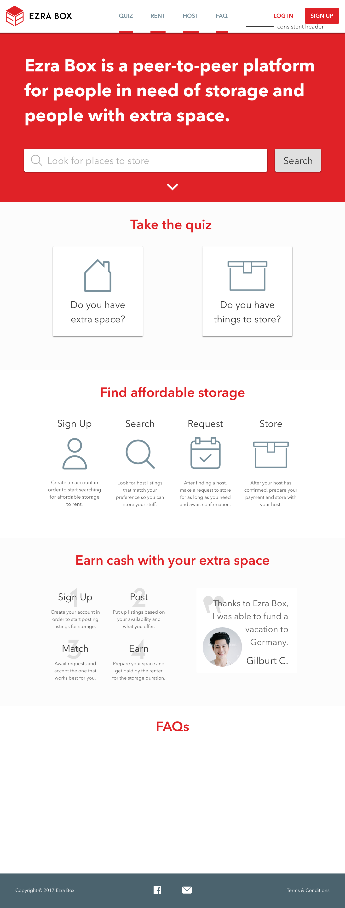
75% of Cornell students originate from out-of-state regions, 25% of which are international. Storage options can be costly, and finding a temporary home for hefty items over long-term breaks can be stressful. Ezra Box is a student run start-up at Cornell University that aims to bring affordable and seamless storage opportunities to the campus community through a peer-to-peer platform. After being an established provider for a few seasons, it became apparent that stylistic inconsistencies and interactive kinks were scattered across the storage timeline. We set out to address these problems during the 2018-2019 school term.
Ezra Box manages the renter-host relationship and facilitates transactions between the two. As a unique yet normalized option for student storage, the platform struggled to keep up with the established competition and diminishing initial excitement from early adopters. To attract upwards growth and momentum, it was time for a design overhaul.
I was tasked with rethinking the renter experience while collaborating with a team of two other product designers and two product managers. I also had the opportunity to take part in the design handoff during May 2019 and contribute to QA sessions with the development team.
Our team won The Walt Disney Company’s Sponsor Award at Cornell’s annual technology showcase, BOOM 2019! The award involves a commemorative trophy, a $750 prize, and is based on broad criteria including novelty, execution, quality of engineering, performance, difficulty, social benefits, presentation, and usefulness.
Role & duration
Product Designer Primary focus on renter experience. Research, Interaction, Illustration, UI, and Visual Design
Abstract, Sketch, Illustrator, Photoshop
Team of 3 designers, 4+ developers, 2 managers
Aug 2018 - May 2019
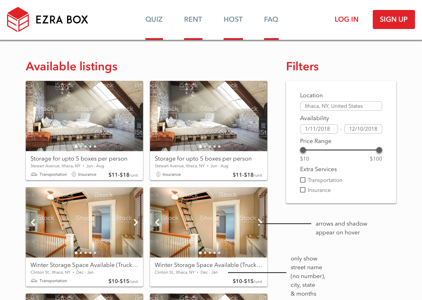
The Challenge: Redefining student storage in 9 months
The goal of the project was to completely revamp the platform’s design by reevaluating the current system to address user bottlenecks and to maximize our business values, which can be broken down into four high-level elements:
Ensure the safety of renters and their storage.
Give students more control over their time and money.
Enable trustworthy transactions and highlight host reliability.
Create a system that prioritizes autonomy and community engagement.
Acknowledging constraints and preparing mitigation strategies
Entirely student run and relatively early stage, Ezra Box was manually operated in terms of assessing and approving hosts, marketing, and customer recruitment. Despite its rapid progress, there were many constraints that served as limitations during the redesign process that we sought to mitigate.
Difficulty coordinating user research studies due to limited contact information/experienced participants, scheduling conflicts, and no real incentive.
Mitigation: Contacted as many known users and had in-depth conversations that provided useful information.
Lack of financial resources and access to data that would inform the team of existing behaviors and metrics.
Mitigation: Collected data through user studies and discussions with founding team members to better understand the platform and existing challenges in order to inform design decisions.
The Discovery: Understanding the renter
At the kickoff of our redesign efforts, we did not have a clear understanding of the current pain points for renters undergoing the storage process. As the platform is mainly renter-facing, it was important to gain these insights. I was able to conduct two contextual interviews with renters from the Summer 2018 storage period to explore how they stored with Ezra Box.
The interviews consisted of open-ended questions that placed an emphasis on urging renters to reflect on their storage experience from booking to pick-up in order to uncover novel insights. I chose to target previous renters who had gone through the end-to-end process because they were able to provide responses based on their direct experience. Contextual interviews that took place in user work spaces (e.g. libraries, study rooms) where they spent the majority of their time completing tasks was the most effective method in triggering recall and fully understanding user thoughts, behaviors, and reactions.
Due to the qualitative nature of the interviews, I organized my findings thematically via an affinity diagram to synthesize different patterns and trends. This method was particularly effective because it presented an overview of the relationships within the data, which allowed me to narrow down the most pressing issues given our constraints. It highlighted key themes across the two users to paint a picture of where common pain points and patterns emerge.
Making sense of the findings:
Renters felt detached to potential hosts and described them as strangers they’re entrusting with important belongings. Renters expected to feel connected to their community in a way that portrays fellow members as dependable, relatable, and kind.
Often, renters and hosts have different schedules, responsibilities, and expectations; however, renters expected hosts to be diligent and responsive when coordinating key dates and negotiations.
The type, amount, and size of items renters need to store is unpredictable, which makes standardizing these varying and individualized components difficult. Renters expected Ezra Box to take care of these details and wanted clear size guidelines without having to negotiate with hosts.
There’s an overwhelming amount of overlap within actions and pages that make the distinct roles of renter and host bleed into one another, stifles communication, and complicates booking procedures. Renters (and hosts) expect to intuitively navigate the platform to find what they’re looking for.
“How might we help renters undergo a seamless storage cycle?”
The Problem Statement: Reframing the Task
It was not possible for us to directly and fully address all these problems in the time given for this design iteration. Instead, we decided to prioritize and break these issues down. Based on the research, I identified the following people problem:
“As a Cornell student looking to store my belongings, I want to book affordable and convenient storage options, so that I can save money and time. But I can’t do that well because (1) I am hesitant to trust a stranger with my possessions, (2) I am unsure how many boxes and at what sizes are appropriate, and (3) the entire storage process is long and requires mutual effort in communication and negotiation.”
After the founders and managers validated and acknowledged these collective concerns, consistency became the underlying underpinning of this redesign. We needed to strip the platform down to its core components to reflect values of trust and convenience while facilitating relationships among renters, hosts, their communities, and our platform.
Keeping the problems in mind, we could design a better renter experience: prioritizing bare bones (shifts focus towards)→ increased trust, better communication, more clarity
Beginning with low-fidelity explorations
To kickstart the idea generation and design process, I began by targeting two main points of contact for renters: the dashboard and search results. Creating low-fidelity wireframes allowed the team to quickly brainstorm and assess what types of features we may want to move forward with and develop further.
The renter dashboard
The dashboard houses the primary administrative and organizational components that give renters an overview of important information to manage potential or in-process bookings. The current dashboard made finding key information more difficult because it gave users the ability to access both renter and host capabilities. This overcrowded the interface and forced users to mentally switch between the two roles, which was counterproductive given that most visitors are either a renter or a host, rarely both.
I wanted to cater directly to renters by thinking of their needs given their respective problems. In addition to removing host capabilities completely, some key elements and changes at this phase were the following:
Activity/Notifications: We discovered a need for holding both renters and hosts accountable for promptly responding and tending to tasks. Notifications were currently being processed through a simple email system that only captures milestones (e.g. booking confirmations) and messages. This constant feed of notifications would allow easy access to immediate updates through the dashboard, which includes anything from storage pick-up reminders and new messages, to a favorited listing becoming inactive.
Calendar: To provide renters with more scheduling autonomy, a calendar feature would allow them to keep track of important dates like storage drop-off dates, pick-up dates, and storage periods. This would help renters plan ahead and view their storage timeline at a high-level.
Favorites: Renters can save time and money by planning in advance to maximize benefits. Creating a favorites section gives renters the power to collect listings they are considering based on their personal preferences and comfort levels while comparing qualities like price-point, location, and accommodations.
Low-fidelity renter dashboard.
Search results
Searching for hosts and storage spaces is when renters decide whether or not to book a transaction. The current search results oversimplify the filters that renters may be interested in sifting through and squeeze listings and their respective attributes into a cramped grid layout. This did not give priority to what renters find important when searching for listings.
I wanted to keep the renters in mind when thinking about how to allow them to find prospective hosts for their needs, thus facilitating easier and more frequent transactions. Some key elements and changes at this phase were the following:
List View: Upon researching different philosophies and looking into popular e-commerce platforms like Depop, Mercari, and Airbnb, it became clear that grid views typically are used when images are the main point of focus and importance. In our case, renters were not very interested in seeing detailed imagery of the space their boxes would be stored in because they were more concerned with accommodations, price, and location. This warrants a list format, which better communicates these elements for each individual listing.
Location Zones: Given that the platform is currently primarily available to the Cornell community, it was counterintuitive to have the location be designated by city (Ithaca, NY) because this would encompass all listings. It is more often than not that renters are familiar with the area, which is typically separated by three distinguishable off-campus zones: (1) North Campus, (2) Collegetown, and (3) Downtown. Identifying spaces by these zones is more precise and informative.
Price Cap: At the time of our redesign, Ezra Box capped a single box’s storage price at $20 regardless of size. As one of the biggest considerations for college students, there was no way to filter the price in the existing design. Thus, a price slider that allows renters to set their own price cap up to $20 would help filter through preferred price ranges.
Transportation: It is not uncommon for renters to need transportation accommodations because many don’t own a car and may not have the resources to carry and move their storage themselves. Having an option to toggle between hosts who offer transportation and those who do not is an important factor when deciding on who to book with because that extra service is often necessary and greatly appreciated.
Low-fidelity search results.
Iterating via medium and high-fidelity explorations
Adjusting and iterating upon our design ideas was messy as we fully designed some elements we later decided to throw away. However, this scrappy journey was imperative to landing at our final solution and it highlights the beauty of the iterative HCI design process. Due to our inability to reach renters for user testing, we instead gathered in our team meetings for in-depth deep dives and discussions regarding different renter scenarios to generate feedback. As a result, the dashboard and search results proved to have their unique share of considerations and hurdles.
The main dashboard underwent three distinct phases before reaching the final version. After fleshing out the initial low-fi wireframe into a high-fi mockup, we realized that we failed to consider some important aspects like navigation and overall composition. The points of feedback and changes behind each version are the following:
The renter dashboard
Version I
While this version of the dashboard had the necessary modules conceptualized like bookings and messages, the navigation seemed awkward because it began to eat away at the page and sacrificed the components that actually held information. Despite there being only three main sections (i.e. activity, calendar, favorites), they weren’t being showcased equitably. We found that the calendar feature in particular did not have the space to be properly tracked and maintained.
Renter dashboard version I.
Version II
In this version, I opted for a standard horizontal navigation and partitioned the dashboard into three parts, one for each section. This created a much more open and organized composition that even allowed the calendar to have a space underneath for appointment descriptions and dates, similar to how Google Calendar displays events.
Renter dashboard version II.
Feedback: After rethinking the calendar, it wasn’t a feature that made sense. Renters often have only one booking per storage period (typically during the summer, late May-August). It wouldn’t be productive for renters to have to scroll through several months just to find a few key dates that pertain to the same booking.
Version III
After some research and ideation, this version saw the birth of the timeline. I wanted to guide renters through the past, current, and upcoming progress of their storage cycle as it’s comprised of some major milestones like booking confirmation and pick-up/drop-off details. This aligns with how renters typically only book one host and maximizes the visibility of the process for organizational purposes, and was also a part of the host-side redesign so that hosts were held accountable for the progress of their individual renters as well, thus facilitating better communication.
Renter dashboard version III.
Feedback: The activity section became unnecessary as it reflects much of the same information displayed elsewhere, primarily the timeline. The redundancy did not provide any value to the renter. A notification bar was instead inherited by the host-side redesign because hosts often have to manage multiple bookings at a time and keep track of many moving parts. We also found that the phrasing of “pick-up” and “drop off” were unclear because it could be interpreted in many different ways (e.g. hosts pick-up boxes to store or renters pick-up their belongings?).
Final dashboard
While the final dashboard may seem like an oversimplified approach, it reflects a solution to our identified problems. By removing extraneous features like the activity section, there’s more clarity and accountability in place because renters have immediate access to the core milestones of their storage process. We also changed the wording to “give items” and “retrieve items” to clearly express renter-facing language. We also expanded the search bar to allow renters to peruse listings at any time.
Final renter dashboard.
Limitations/Improvements: Currently the dashboard design does not account for more than one storage booking at a time because it was not a frequent occurrence, however, designing for these edge cases would be a good way to move forward. The design could also be more clear in terms of the time frame by providing the year in the data – we find renters typically book listings a few months prior to the summer, however, accounting for renters who may plan ahead or book during different seasons is another important consideration to make.
Search results
There were also three distinct phases of revisions when designing the search results. We did not address a main point of contention for both renters and hosts when booking, which is availability in terms of how much space the host has open and whether all the renter’s belongings can be accommodated. The points of feedback and changes behind each version are the following:
Version I
This rendition of the search results held all the necessary components of the listings, provided more robust filters, and introduced modals that renter could use to quickly assess listings and hosts without having to navigate to multiple different pages. However, the design did not address consistency or convenience for users. We found that renters found the process cumbersome at times due to the negotiation and constant communication with hosts, which was partly influenced by how it was unclear whether or not the hosts cloud accommodate all their boxes. This is because there was no way to gauge available space in the listings because it was not provided by the platform.
Search results version I.
Example modal for quick-view mode.
Version II
In this version, I experimented with a counter feature next to each size box to indicate how many available spaces are open for each respective listing. This would help renters estimate whether the host could fit their belongings.
Search results version II.
Feedback: The counter became a complicated area of discussion because it was a bit unclear as to what the number represented situated beside the different box sizes. Its purpose was not obvious, and did not provide clarity for renters.
Version III
In this version, I researched different possibilities and began to explore segmented progress bars, similar to what Apple uses for storage space, to give renters a high-level idea of how much space a host may have without being too specific to the point of confusion. By hovering over the bars in each listing, renters can see the sizes and number of boxes currently being stored compared to the remaining space. This places less of a burden on providing exact numbers, but also gives renters more information so that they can make informed decisions.
Search results version III.
Apple storage space meter.
Availability bar on hover.
Feedback: After conducting a QA session with some members of the development team, it became clear that any type space availability tracker or meter would be too large in scope for the current project. Creating these meters would require hosts to input and constantly update their storage capacity, or rely on the backend to gather this information to provide estimates. These approaches would sacrifice accuracy and would be bothersome for hosts, especially if they manage multiple renters.
Final search results
After a long process of brainstorming how to showcase available space, we decided to scrap the feature entirely as it did not make sense technically or interactively. We did, however, want to emphasize the safety of hosts by providing different badges (e.g. reliability based on successful storage periods, fast response times) and humanizing their profiles by providing avatars, verification markers, and their affiliation in the Cornell community. This was our way of circumventing the issue to build trust and promote clear communication in a way that would allow renters to negotiate these elements instead.
Final search results.
Limitations/Improvements: It would be effective to give hosts ratings so that renters have more peace-of-mind when deciding where to book.
Additional high-fidelity mockups
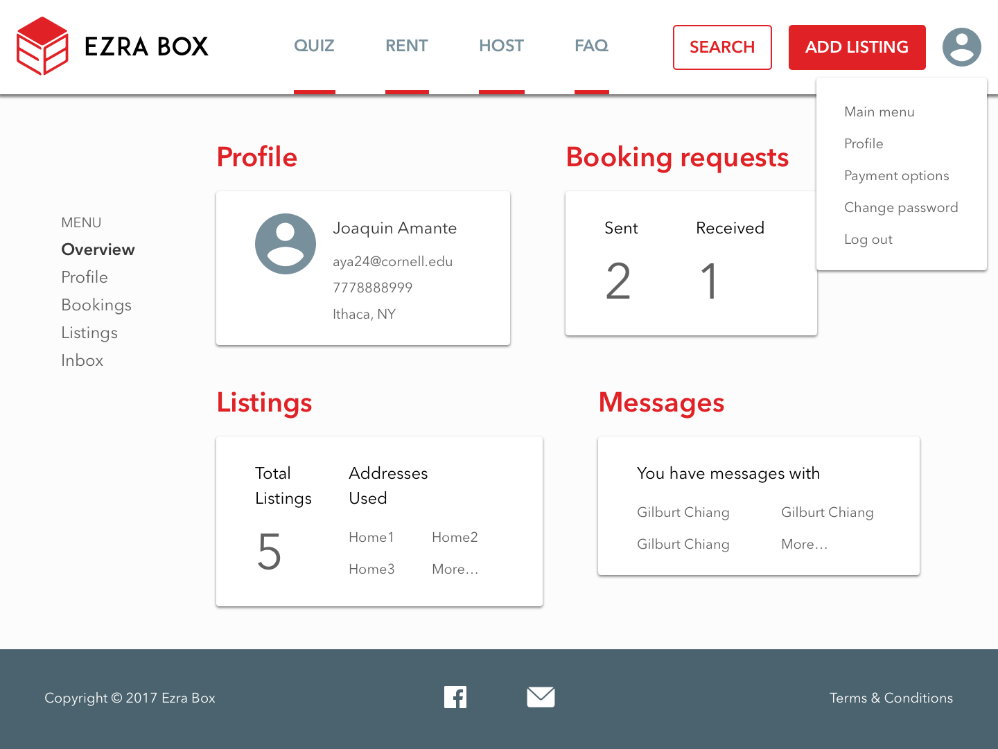
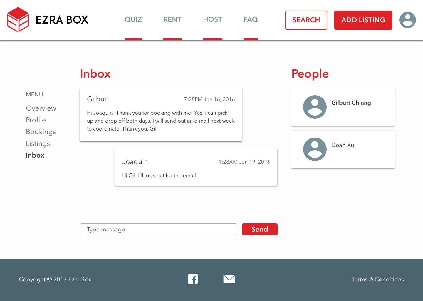
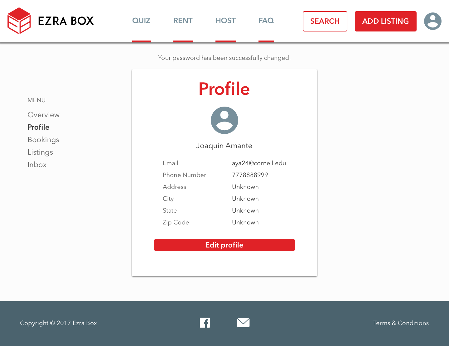
Although I primarily focused on designing the renter dashboard and search results, I had the opportunity to “wear many hats” at Ezra Box and contribute to other elements that augment the renter experience. I was able to design additional screens like the bookings, messages, and profile, which didn’t require any major changes besides aligning its style and consistency with the rest of the redesign. I also created a set of icons for the platform and a size guide, allowing me to build my illustration skills.
When designing the bookings, messages, and profile, I wanted to reflect our design philosophy of simplifying the interactions for renters. To accomplish this, I stripped down each component to its basic functionality to create straight-forward, understandable, and familiar elements.
Bookings
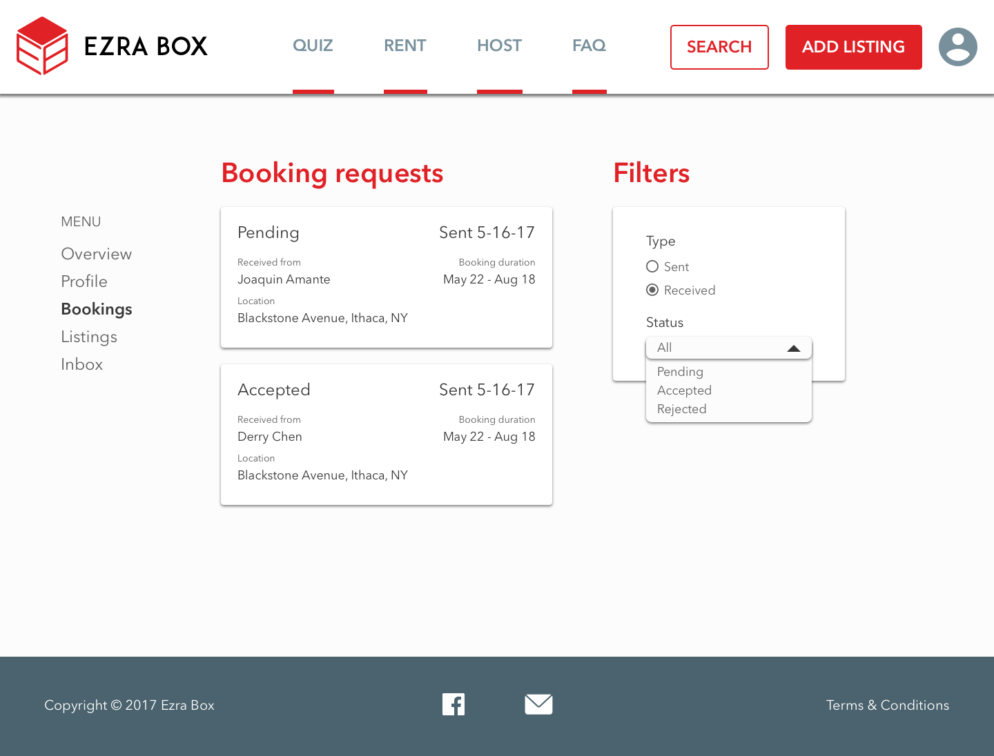
Basic functionality includes allowing renters to access past or completed bookings because we found renters preferred familiarity and the ability to rebook a host. Standard information about each listing and the host are included in each booking component so that renters can view more details.
Final bookings: active (pending, accepted), past/completed.
Example of accepted booking component.
Messages
Basic functionality includes standard messaging capabilities, including new message indicators (i.e. red dot), typing animations, and attachment compatibility. One area I wanted to emphasize was having both the renter and host’s avatars readily apparent at all times to highlight and humanize the users behind the profiles. This creates a friendlier environment and replicates more realistic communication channels, which may also encourage responsiveness and accountability.
Final messages: new message indicators, standard messaging markers.
Profile
Basic functionality includes general account information, notification preferences, and editing options. I wanted the profile to be a space where users indicate their affiliation to Cornell, emphasizing their connection to the community and contributing to the welcoming and familiar feelings on the platform.
Final profile: alert settings, general information, editing capabilities.
Icon set and sizing guide
For additional graphics, I used Photoshop and Illustrator to first sketch out potential options for the main icons that I then presented to and discussed with the team. After deciding on the best options, I was able to vectorize these sketches into a complete set in addition to a sizing guide that would hopefully aid renters in gauging their storage needs.
The Results: Earning $$$
We set out to enable renters to trust hosts and partake in more efficient communication; through humanizing accounts, outlining a storage timeline, and bringing simplicity back to the platform, we were able to accomplish our goals. Given the constraints of the redesign, we were not able to conduct formal user testing sessions. However, scenario-based user tests are high up on the radar for Ezra Box’s future design iterations. Instead we conducted usability tests with the team, and I was able to take part in QA sessions with the developers where we discussed the feasibility and implementation of features like the availability meter and timeline. The redesign was also evaluated through quantitative metrics:
Over $2000 in revenue during the Summer 2019 storage cycle. We were able to ship an MVP with preliminary implementation, and we had an influx of repeat users on both the host and renter ends.
Won The Walt Disney Company’s corporate award at annual technology showcase. We pitched our design process at Cornell’s annual BOOM showcase and won $750 in prize money.
Final thoughts
The messy evolution of Ezra Box’s 2018-2019 redesign was a long but gratifying journey. Redesigning a service that had been previously established was a daunting and challenging task, but the experience, takeaways, and results created a worthwhile project. Given the limitations and capabilities of the start-up at the time, many compromises had to be made. Some important lessons I gained were the following:
Communication with developers is pertinent – there are many refinements and compromises that come from translating a digital design into a developed product. Having conversational programming skills is imperative to guide these QA sessions and discussions in a respectful, understanding, and effective manner.
Collaborating with other designers takes practice – working with other product designers for the first time was an exciting experience, but it took some time to navigate differences in style and workflows. Maintaining consistency was important for the final designs, and active communication played a large role in this success. Familiarizing myself with new collaborative tools like Abstract was also an exciting experience.
Be open to change – working in a fast-paced and deadline-oriented environment induced many pivots, ideas, and changes. Tasks moved quickly, designs were regularly scrapped and restarted, and I had to learn to embrace these changes to truly believe in the final designs. It became about whether these changes sparked conversation and addressed user needs as opposed to becoming “married” to the current design ideas.
During the completion of the designs, the development team was working on beginning implementation. However, due to limited resources and rotating team members, these processes are still underway. I am no longer affiliated with Ezra Box.


